Tuesday 11 November 2008

WANTED.

Wanted.

An over the top cheesy action film, with a god awful plot, but i liked it.

It was like the Matrix, but with better actors and a different plot... well there was just the slow down, time lapse fighting that made it like the Matrix.

If your big on special effects and violence then this is the perfect movie for you. And, it as Angelina Jolie in it, although i thought she looked a bit like a crack whore.

You don't really see special effects like these anymore, where they actually blow up things, its all CGI... don't get me wrong there were a lot of CGI in this... i mean they even CGI'd the rats! But there was a nice balance between the two styles.

I'd definitely recommend people to rent it out, but not buy it, unless you can get it for under a fiver.


The Three Burials of Melquiades Estrada

This has been one of those films that i've bought, put with my DVD collection and forgot about... what a silly mistake!

You should watch this film just for Tommy Lee Jones' performance and the beautiful cinematography of the landscapes.

The story is alright, but T L Jones really pulls out a performance, but he did direct it! Again i cannot stress the cinematography, very, very good.

If you get a chance give it a watch.


Speed Racer.

I'm not sure why I watched this one... possibly because i get free rentals and i was house sitting and there were a blockbuster near by... And when a film gets shot to dead by the reviewers I like to see if they were correct...

In this case i think they were a little harsh, the concept is dire, some of the acting is weak and it all looks a bit bright and colourful, but lets not forget this is a kids film.

The special effects are pretty good. I don't like the style, but what they have done is proper good. But what do you expect from the guys that made the Matrix (first one, the other two are laughable). There are little bits of design that float around in the background that you know the CGI guys slaved over, and your average weekend film renter will not even notice. The camera work is very impressive and to say most of it would have been green screened, the actors and directors will have had to really think about what they were doing on set. I enjoyed the layering of footage, especially on the transitions. In the races they used the commentators as screen wipes.

I'm a massive Emile Hirsch fan, so it was hard for me not to like this. However, it wasn't a great film, not even a great kids film... probably 5 or 6 out of 10, but it was entertaining. 


Howard the Duck.

Howard the Duck. (1986)

This month saw the realise of a childhood classic that had been lost in my memory.

One day last week at work i opened a box of deliveries and there it was the DVD of Howard the Duck. I couldn't believe my eyes, the memories came flooding back.

I bought a copy right away for the bargain price of £3.20 (blockbuster discount). When i watched it I was shocked to see that it still looked good! Howard was made in 1986 (the year i was born). So, obviously i wasn't there for the release, but i caught it on TV.

Produced by the KING of Sci-Fi films George Lucas, but not even that saved Howard from bombing at the box office. Hopefully now it can get its glory on DVD.

Howard the Duck is a strange story about a parallel world, with the dominant species being DUCKS. When a scientific experiment goes wrong in our world, Howard gets sucked from his to ours. He lands outside a nightclub where he meets struggling rock singer Beverly. Beverly helps him find away back home through two scientists. But, when they try to send Howard back they accidently suck down the Dark Overload of the Universe. Then its Howard's task to save the world.

You can see how this film failed.

For 1986 the final Dark Overlord effects are great, just as good as The Terminator (2 years before it.) The stop motion is smooth and looks like it was there on set, but obviously it would have been green screened, or black screened, or whatever they used back then.

It also features a young Tim Robbins and a great comic performance by Jeffery Jones.
I'm not saying you should rush out and buy a copy, but if you do come across a cheap one, don't hesitate just buy it. This cult classic will look cool in your collection.

The Constant Gardner

Constant Gardner.
Written by James Wall.

Constant Gardner was a powerful movie about corruption, politics and miss-use of a third world country.

The first fantastic point I’d like to mention about the Constant Gardner is its narrative, the story is told in an unusual way. Once we get past the introduction of the characters the film shows us an important incident. Then the story splits into two timelines. The two timelines start at different points, one being of how the incident happened and the other being how the incident is investigated. The film switches between the two as we learn more. I believe this helps to portray how unexpected the incident is to the main character (Ralph Fiennes) and also shows us how scattered and confused this mind is.

This dual timeline doesn’t last the whole film and the two meet about halfway through, which makes the story back to a linier timeline. I personally would have liked that style of story telling to have lasted longer. It made what could have been a long drawn out drama very interesting. I also felt it made me (the audience) feel closer to the film, as if I was investigating the mystery with him.

I thought the use of camerawork was good. In certain scenes the camera wasn’t traditionally set straight on a tripod. It was wobbly, handheld, like it was in first person view. Again this made me feel apart of the action.

The acting was ok, but nothing better than I have already seen. The stand out performance for me was from Pete Postlethwaite. He wasn’t in the film long, which was a shame. But, if I had never seen Poslethwaite before I wouldn’t have realised he was putting on an accent. Ralph Fiennes was good, but I have seen him playing the “English gent” too many times. It was refreshing seeing him earlier in the year completely out of character in “In Bruges,” were he played a-double-hard-cockney-bastard and he blew me away.

The use of colour and scenery was really nice, helping with the story. The use of de-saturating the scene leading up to the incident helped the viewer realise these scenes were in the past. The long shots of the deserts showed us how isolated and alone Fiennes was. Nobody seemed to want to help him without a push.

I did feel there was an over use of showing starving African children. Sometimes it felt like a red nose day commercial. It seemed like a cheap shot to make the movie more hard hitting and it didn’t need it.

I give The Constant Gardner a James Wall rating of 8/10.

Saturday 25 October 2008

Evaluation. Ident

Evaluation.
James Wall
FEAR Ident.

I thought this was a good project to start the new year off with, a short interesting piece. When given the brief I was immediately drawn to the “Fear” option, although I did consider and have a good think about the other three. I wouldn’t say that horror/thriller is my comfort zone, but I do think at this stage horror is easier to create and make look good.
I dived straight into this brief and started planning and creating off the mark. After the short horror film we did at the end of last year I had a much better idea of time keeping. This year I have bought myself a pocket diary and so far I am keeping to it well. I think there is still room for improving in time keeping, by the middle of the project I started to stray, but pulled it together by the end.

Learning After Effects as been a massive plus. Never used it before the brief and I feel it came natural and I can open the software positively and know my way round it. I believe the most impressive after effecting section of my ident is the person appearing around the strange steps. I think this because I had to mask the person onto the steps and then I masked a static TV signal in the same shape to make it look like the person were tuning in and out, much like on the Ring.

I also think my Final Cut editing skills are getting loads better. I seemed to be-able to edit quickly and have learnt the key board short cuts. However, I am still have great difficulty getting my exporting right. At the moment I like to export a quick time reference movie out of Final Cut then export it again through After Effects.

Looking back over my work I would have liked my presentation to be more professional. I do think my presentations are becoming more confident and I’m starting believe in myself, that I do have something to provide and be proud of. And, I think that is the key to a good professional presentation, if you believe in yourself than others will too. I know I have the ambition to want to do well, but now I have to convert that ambition into confidence.

Overall I am pleased with the outcome of this brief. In the way I have worked as an individual and known when to ask others for help. For example when filming I knew I couldn’t do it by myself, so I made sure I planned time with another student to get it done. This was probably the first brief I felt completely comfortable that I was going to get all the work done on time, (besides this evaluation).

Now I am looking forward to tackling the next brief, knowing that I am not worrying and I am pleased with this ident brief.

Tuesday 21 October 2008

DONE! FINISHED! POW!

YEY! I've finished the editing on my ident. I have to say i am very pleased with the out come.
Please follow the link, and watch it in full high quality youtube fun. http://uk.youtube.com/watch?v=FSTbV3RkdTg .

Cheers

Monday 20 October 2008

MOOD BOARD

This is my mood board, i have been adding to it over the past few weeks as and when new pieces have inspired me.
When you click the image you can see a larger scaled one.

Tuesday 14 October 2008

Films i've watched recently...

For the people that don't know me that well yet...i love films, i spend most of my time watching them and believe i have a good judgement on what makes a good flick. I watch all sorts of films from comedy to world cinema and action to drama, anything.
Here is a couple of films that i have watched over the past week or two that have stuck out.
I've watched or re watched a lot of horror films, for research for my college brief.

MONGOL. The story of Genghis Khan.
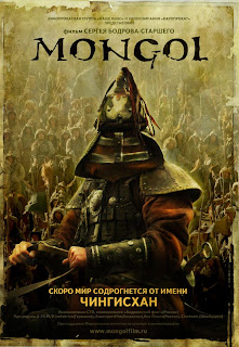
Mongol was visually great. The long shots of landscapes in all types of whether looked awesome. The film was so detailed. The battle scenes were very well created and the CGI is subtle, It wasn't like your Hollywood epic battle film. You don't realise that the blood has been CGI'd until you take a closer loook. I would recommend this to anyone, and the rumour on the net is that this is the first of three films.
My only problem with the film was the subtitles, they were difficult to read in parts the lighter parts of the film.

THE HOST.
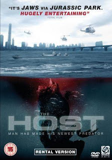
This was a good, a Korean film. Reminded me of the old B-movie films, i didn't know whether to laugh in parts or be scared. Again the visuals were excellant, i've always said that the orients have better use of cinematography and colour balance.
The only thing i could pick at is the sea monster, the interactivity with the monster is very good, but close ups of the monster didn't look as good. I think this is down to the textures, it was very smooth looking. I reckon a bit of texture would have made it a whole lot more believable.
You can see this was inspiration for the recent Cloverfield.

BRAINDEAD.
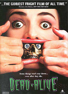
Pete Jackson's finest two hours...only kidding. I re-watched BrainDead having not seen it in a few years. It is quite ridiculous, but thats what makes it good. I don't know where in Peter Jackson's head he thought of a RAT MONKEY! Not only a rat monkey, but one that bites people and turns them into zombies would work... The stupidest ideas truely are the best.
I don't think i've seen a film with this much blood!
I think it was made on a small budget (around 1.5million) and to say that...the SFX are good, their not remarkable or groundbreaking, but for the style of film it works.

OTHER FILMS I'VE WATCHED
The SHINING
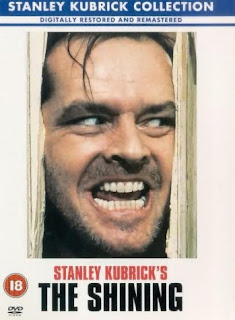
What i love about the Shining is the sound, it's not like most horror. It's nice classical music, but every now and then it hits a de-tuned note. It's like John Williams doing horror.

THE INCREDIBLE SHRINKING MAN
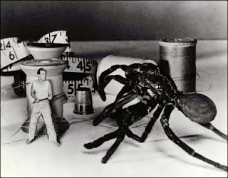
The Incredible shrinking man is remarkable for its time, its a most see film for people interested in visual effects. They were doing things well ahead of there time.
You won't see a film like this now-a-days, because studios will always opt for CGI. The massive sets are really impressive.
I loved every second of this film.

Saturday 11 October 2008

Return of Jafar!

Aladdin was a great film, a landmark in animation.

I've recently bought the box set trilogy, and at the time of purchase i'd never seen the two follow up movies. I knew they weren't going to be as good as the first one, but i thought they must be decent films.

I watched Return of Jafar last night and what a piece of shit. The animation wasn't bad, but for disney standards...for Aladdin standards it was very poor. The songs were just hash pieces, re-worked songs from the first film, but with the awful parrot singing them!
I thought the film was going to pick up when the genie enters, and to my surprise HOMER SIMPSONS voice comes out. I knew Robin Williams didn't do it, but i didn't know Dan Cast-la-dilli (how ever you say it) re-placed him. When i was watching it i was thinking i'm sure thats Homer...

Anyway, i've checked the third one out on IMDB and Mr Williams is back so it might be alright, but if this is something to go by i wish i'd have just bought Aladdin.

Thursday 9 October 2008

Title sequences break down.

Hello,
I thought i'd take out the time to do a break down of my after effects channel four horror season title sequences. This is not the one i am going to use in my final ident, but it is close to it.

I am not that great at after effects, only been using it a week, but i hope this helps anybody having trouble. It's not a tutorial, but more of an order.
First off here is the sequences.


Right, the first thing i did was make a composition and then imported a channel 4 logo from the net and colour corrected to black and white. Then i animated it. The scale first, key framing it from large to small. The 3D and light/colour effect i didn't add till the very end. After that i added the FEAR text, which goes from right to left, getting bigger. The idea was to have it coming from behind the 4. I used an effect called "glow" to...yes that's right, make it glow. I key framed the brightness to dim in and out, i did this to make it more eye catching.
OK, then i key framed each individual letter of the "horror season" to fall down at different speeds to get the fallen, drip feel. The last bit for this first part was a simple opacity fade of the coming soon...

Once i was happy with the time scale of this i opened a new composition and dragged my previous one in. I did this so i could work with all the elements as a whole. I can later go back to that first composition edited it and it will change in this new second composition.

Ok, I made the whole sequence a 3D layer and added a spot light and 25mm camera. I key framed the light to change from a light yellow to a dark red, which helps translate the theme. I edit the features within the spot light, for example the intensity and feathering. Then i key framed the camera to zoom out on a tilt, then square up with the red light and lastly zoom in right towards the 4. This gives you the feel that the 4 is moving around much more than it actually is.

SOUND and VISUALS, Fear ident.

On my previous blog you can view my animatic with the near to finish sound and and idea behind my footage.

What inspired the sound was the word "innocence". There is something very displeasing about innocence sounds, a young girl singing, a whined up ballerina toy, the sound of a baby laughing or crying.


Also Japanese horror, films like the Ring and the Grudge have these very beautifully crafted sound tracks. Here is the trailer for the Grudge,

the trailer portrays exactly what i am talking about. It starts out quite dark, ambient and then this nice piano takes over, but it still feel wrong.


This is the Trailer for the ring

This shows the kind of idea behind my background score. I used reversed and slowed down music, then picked out bits of song (which are song recordings of my old band) which sounded right.

For the visuals i am going to create footage which in corporates both cult and contemporary horror/thrillers. I think this will appeal to to all horror fan audiences.

Monday 6 October 2008

Ident Animatic

Hey hey,
I've done a mock up of my Channel four "FEAR" ident as a animatic.
Traditionally animatics are still images, but with this idea it was very hard to plan out on paper how i wanted it to look. So, i thought i'll just do it! I've filmed sort of what i will do.

My idea is to make you feel like your TV has gone dodgy and then these unsettling images appear. You can also hear my soundtrack, but that also needs tweaking.

Here we go


I know that youtube isn't the best quality, but i think it gets my idea across. Also the cut footage is just a knife and a sink, i do have other footage in mind to film.
The sound i am really pleased with but i'll explain that in a new blog.

Multipul Me's!

I've been testing my skills out on after effects, i really like doing special effects. I've never been a massive fan of too much CGI/post production work, but i can see why production companies opt for this. I think post production or SFX is an area i'd like to start in...possibily...

Anyway this is me five times in the same room.

"How did i do this?" i hear you say...
Well, I filmed myself five times, then layed them up in after effects and masked round four of them. I thought this would be a lot harder than it actually was.

My next task is to make my head blow up! using a combination of post production and on set SFX.

MAX PAYNE

The new action film Max Payne as we all know is an adaptation of a video game. I don't think there as ever been a good video game film! FACT!
Here is the trailer.


The one Thing i have read, which is pretty cool is that the makers have used a new type of camera the records at 1000 frames per second. This means they can get that super slow motion effect like in the video game. You can see this effect in the trailer.

From the one and half minutes i've seen it looks rather like a story from Sin City, the sound, visuals and style.

I suppose we'll have to wait and see...

Thursday 2 October 2008

after effects

Never used after effects before this week, i've had a understanding about it, how it works and what it does. And, a couple of times i've even opened it clicked a few buttons and closed it down. After effect is a program i have been wanting to learn and i have relished this oppurtunity to learn.

With the few skills i learn't i my first class i made these channel four "fear" title screens.

This is my first attempt

Basically it is a photoshop file and i have layered the layers on top of each other in the correct order and animated them. This technique can work to good effect, used in the right way. I have also used a spot light, to give it a feathered edge.

SECOND ATTEMPT

This attempt is better. I've used the spot light more effectively, animating it, using it to help create an atmosphere. I have also animated a blur on the text.

THIRD ATTEMPT

On this one i have used a mask on the text so that when the spot light intensity gets higher the mask fades in. I believe this works well.

FOURTH ATTEMPT

This is similar to the third one, but this time i've used a camera. The cameras in after effect are a great tool, thay enable you to create a 3D style look.

After combining all my skills i have created this ident.

I think that this is pretty close to professional. I've used many skills, Cameras, lights, key frame animation, compositions inside compositions, the lot. I'm really pleased with this effort.

Monday 29 September 2008

Ident sound scape

On the creative side of this brief i am going to start with the sound. I believe the sound is a good place to start because it creates the atmsophere. The sound makes a visual scary, Freddy Kruger would have looked shit in a silent movie, but with the right music and sound effects he takes a complete different form. Thats how important sound is to film, if they would have put clown music to the ghost face "Scream" killer...well you would have Scary Movie (which with out going of subject are the worst types of film), but i think i make my point.

With the sound i can make an instant impact, which i don't think i could do with a visual. Also if i have the sound to work off i believe the visual will come naturally, as for if i create the visuals i'll have to make music to fit.

Thursday 25 September 2008

New YEAR, New BRIEF. IDENT

Ah, the start to a new year, a further step into my career.

The new brief title is "IDENT" a 20 second trailer for a programme on a TV channel.
The stand out programme, or in this case season is "FEAR" an ident for a series of horror/thriller films on channel 4.
My first step of research is to view other idents form previous horror seasons.


This is bbc's 2 ident.

My firsts thoughts are the eerie location, which is a graveyard. I think this is a bit cheesy, however you instantly know it is a advert for something scary. Then there are the clips of classic horrors, which confirm it is an advert for a horror programme. The music is also key, loud and dark, creating an atmosphere. And, finally the deep voice over. A film trailer classic. I believe BBC 2 have gone for the B-Movie look, with the mummified "2" at the end. This isn't really my thing, looks a bit "Buffy the vampire" really tacky

This is ITV's

This, personally, is poop. It's just a montage of horror clips with a cheesy song about the boogyman. Not good what-so-ever, the guys at ITV obviously couldn't be bothered that day. This is an example of what not to do.


This is TV3's

I'm not totally sure what TV3 is, but this is a good attempt at something original. If i'm honest i'm not sure if it is for a horror series. But, I like how its unexpected, it seems like a advert for a music programme and then BAM! there is blood everywhere.


This would be the trailer for the american re-make of The Grudge, sorry for the Sarah M. Gellar intro.

What i like about this is the invert hair, for the titles/credits. It's a nice colour scheme, not one you would label with horror, but it as a soft uneasy feel. The font also flows with the hair and there is something unsettling about the distorted/larger letters in the font. The music helps with this though.

This is 2 trailers from The Blair Witch Project.

The second trailer is better than the first one, but neither of them are that great. What i do like about them is that in parts your not quite sure what you are looking at, and that unsurity is scary. The bit with the hand prints on the wall. When you think about it they could be any old hand prints, but with the right music your head automatically goes to blood. Also, the bit with the girl running, again she could be running away from anything, but we think it is something terrible.
I also like how the short text at the beginning sets the tone for the whole trailer.

What i have learn't from these few idents and trailers is that you have to identify your audience quickly. I wasn't a fan of the BBC2 ident, but it captured the horror feel instantly. However, i feel they did it in the wrong way, i previously said that i think they went for a B-Movie look, but it was too polished, they could have added film grain. It also mixed gernres, It was set in a graveyard, which we normally associate with zombies, but a mummy jumped out of the grave.
The TV3 ident did not indentify the horror audience at first, and if i'd have seen that when surfing through the channels looking for something about horror then i would have gone straight past it.
The horror trailers are good examples, because they get to the point. The music is right, the visuals fit and you know exactly what your watching.

I think with this ident being only 20 seconds long you have indentify the genre within 3 seconds and keep the pace going.

Wednesday 30 July 2008

THE DARK KNIGHT

WOW, I went to see The Dark Knight twice in it's first weekend. It is really good. The medium is just right, not too dark, but not too commercial. Chris Nolan was the perfect director for this series, he has some how taken the comic book cheese genre and turned it into a serious thriller. Which is F*****G brilliant. The film has been a massive success so far in the USA and its been the first film this year that i've seen fill a cinema, every seat was sold. I even saw one person sat on the steps! Both nights i went to see it...PACKED. I couldn't believe it.


Heath Ledger as Joker was such a good choice. When i first heard he was taking the role i was a bit unsure, but he did it better than i could ever imagine. And, it's a real shame, i knew he was a talented actor, but this performance will go down in history. Even if he hadn't have died it would have still been a historical performance.

There wasn't enough of the Joker, when he was on screen it was really exciting and you didn't know what he'd do next. Ledgers performance brought so much energy to the film.


It seemed like an introduction to his manic personality and the next film would have shown you the real Joker.

There as been talk on the net that the Joker was written to be in the third film, but rumours have it they've scrapped the script. They don't want to re-cast him, but i think they should. Ledger has brought to life a great character and there must be more than one person who can do character acting well.

On the movie forums Johnny Depp's name is being thrown around, and yeah, i think he'd be good. But, there must be more than Depp around. His name is up for every role.

The SFX were outstanding too. I'm not going to in to them too much. But, it's been awhile since i've seen some real nice big explosions. It's all CGI these days, i'm sure there were CGI in there to make it look bigger. But i remember the days when if you have written that a helicopter gets blown up, then you blow up an helicopter. I understand that its quicker and cheaper to do it CGI, but never looks the same.

All in all, it was a fantastic film, the best this year and it'll be very hard to beat it.

HD not for me.

My step dad has recently bought an HD TV and a blu-ray player (he has taken back the player because blu-rays are a little over priced).

I can't stand watching films or even programs on this new technology. It seems to make everything look tacky. I believe there is TOO much detail.

I watched a seminar With Robert Rodriguez not so long back, it was just after he finished filming Once Upon A Time In Mexico. It was the first film he shot in digital HD and he said you can't get enough detail. RR is one of my all time favs, but i have to disagree with him. I watched 10,000 BC a couple of nights ago, really bad film and not a good choice to test HD out, but i knew that before i put it on. Just wanted to see how bad. HD made it look unbelievably crap, it was like watching a film in layers, like a pop-up-book. The real layer with the actors and a set, then a layer of CGI mammoths and a green screen background. I'm not over-reacting it was that bad.

I thought it might just be 10,000 BC, so i checked the sky movie channels and saw Spider-Man 3 was on. I was blown away by Spider-Man 3 at the cinema and HD even made that look poo. I watched Frankenstein (the Rob De Niro one), which was made a while back, but i wanted to see what it did. And that looked really bad, you could clearly see that they were on a set and using stage lights. I dread to think what 300 looks like.

I think the film industry hasn't caught up to the TV technology yet. Old films will never look right on HD, but hopefully the future ones will.

Thursday 24 July 2008

Off To See THE DARK KNIGHT to night.

Had my tickets for awhile now, and i'm honestly unbelievably excited, like when it was christmas as a child.
And, what got me more excited was this remarkable website.

I will give my full review on the Dark Knight tomorrow.

Tuesday 22 July 2008

Wall-e


Wall-e Website, check it out it's cool.

So, went to see Wall-e last night.
What can i say, which hasn't been said already?...WOW.


Last year Pixar brought us Ratatouille and i didn't think they'd top that animation for a couple of years. How wrong was I? Wall-e has taken this beautiful art to the next steps already. The detail on Wall-e for a start is incredible. You can see all the mechanism's working in his eyes, the rust and most of all the emotion. The film doesn't have dialogue for 75% of it, but you know exactly what he's thinking. Also getting back to detail, Earth looks brilliant, well it looks like a mess. But, that mess looks brilliant.
The sound design was very clever, reminded me of R2-D2 (Star Wars). You can clearly tell what the certain sounds mean. The use of camera angles were good, No, they were outstanding. The was a scene where it started as a long shot of earth and then zoomed right in to show wall-e at work. I picked up on the good use of camera angles on Ratatouille, focus pulling, quick editing, it makes it feel more like live action feature.


When i first saw Eva i didn't think she looked that great. I know she is suppose to look modern, Ipod-ish, next generation sort of thing. But, next to Wall-e it looked plain.
However, towards the end of the film there is a super close up of her face and you can see all the little lights under the plastic that make up her eyes. It's his sort of detail that makes you want to stand up and applaud the Pixar gang for there work.

If i had to pick fault, i mean really had to dig deep to find fault. I would say there wasn't enough of Wall-e and the bug by them self. Within 15 minutes Eva is on the seen and i really liked watching Wall-e explore the world and his reaction to the items he found.

Thursday 17 July 2008

Stan Winston RIP

This last month one the great visual effects and make up wizards Stan Winston died.
He had done some great creatures, including the Terminator, the Queen Alien, the Preditor, Edward Scissorhands, the T-rex in Jurassic Park and the none CGI Iron Man suit.

He worked with Steven Spielberg, Tim Burton and James Cameron many times.

There aren't many still in the model making business and he was the go too guy if you needed one. He Won 4 of the 9 Oscar's he was nominated for. He was a true legend.

This made me think that there are many people in the film business that get under thrown. You always hear about the Actors and Directors and they get the big awards, but films would be nothing without SFX, editing, music score, camera men, etc

So here are some amazing people (off the top of my head)
Danny Elfman (music)
Ray Harryhausen (SFX)
Ray Winston (SFX)
John Williams (music)
Frank and Ollie (animators)

The Phantom. The Spirit. The FRANK MILLER.

The Phantom is a new camera, which has become the key gem for Frank Miller's new film THE SPIRIT.

The phantom shoots in super slow motion, it captures 1,000 frames per second rather than the usual 25. This mean you take a tenth of a second and turn it into a minute of footage.
The Digital effects guy for the film Stu Maschwitz says "It's an astonishing effect - not like anything you've ever seen". Which, is unbelievable because this man who also did Davey Jones in Pirates of the Caribbean, Superman Returns baseball pitch scene. Die Hard 4.0 Fighter jet fight with Bruce and the Iron man suit.
He is pretty ground breaking and if he can be shocked at this then it must make the average film geek (like myself) go wild.

Frank Miller isn't as-well-known for his film making, but in the last few years he has brought us Sin City and 300, which were both amazing films. And, both re-invented film making. With them being shot completely on green screen. Again The Spirit is another green screen film and from the trailer it looks a lot like Sin City, but in the recent preview in Total Film magazine Frank Miller re-assures us that it is very different from Sin City. Plus, its in full colour.
It looks like a comic book come to life and i can't wait to see it.It's due out in November. If you can't wait that long then go buy the special two disc version of Sin City and sink your head into the bonus features, they're mind blowing and if your interested in making movies it also gives you some tips.

Sunday 29 June 2008

A Beautiful Mind

Last night I watched A Beautiful Mind. It's been on my shelf for awhile and it was one of those films that i looked at and thought...mmm, can't really be bothered tonight.

However, last night i decided to watch it...
AND, it was super. Well deserved all the Oscars it won. You can't really say much about the storyline without giving too much away.

I'm not a massive Russell Crowe and Ron Howard fan, but this was exceptional. It was so beautifully written, the acting were fantastic and the cast was really well assembled.

Recently i've been right into my CGI "blockbuster" films, which isn't really like me. I think its all the After Effects developing i've been doing, makes me appreciate it more. I'm a quirky drama film fan and this film brought me right back down to my routes. You don't need big effects to make a good movie, just a strong script. Which, is the backbone to a great film. A good set of actors and the right direction.

Quintessential Tarantino

Over the last few months when i have sometime or can't sleep i've been reading Quintessential Tarantino, i'm about half way through.

It's written by Edwin Page, who seems to love Tarantino a little too much. He breaks down each film written, directed or written and directed by QT. So far it as been an interesting read. He spots things out that you might not have noticed, but he sometimes over analyses parts and over repeats himself.

For aspiring film makers it is a good read, especially if you like QT. It points out the techniques QT has used and why QT re-invented certain film genres.

Friday 27 June 2008

Pirates of the Caribbean: At World's End

POFTC: At World's End, I went to go see this on its first weekend at the cinema and it was one of those rare occasions when the cinema is really FULL.

I try my best to get out and see the big "blockbusters" films at the cinema (because, thats the only way you can see them), and its nice to see it packed. This doesn't happen very often these days. Over the last few years the only films that spring to mind that have pulled the big crowds were Spiderman 3 and Charlie and the chocolate factory.

Anyway, big POFTC fan and I bought the third one the days it came out on DVD (£9 from morrisons, double disc edition). Its been shrink wrapped in my collection for about half a year now. I've been waiting to watch the trilogy back to back, i'm really sad like that. You get a feel for the story much better. BUT, last night i couldn't sleep and wanted to watch something visually spectacular, so i put it on.

AND, WOW, It is really special. The three films as a whole are great, and this is a BOLD statement, but i don't think i've ever seen anything as visually pleasing as these films. Granted, the CGI in the first one looks a little dated now and i could pick faults out that i don't think look as good as others, but why point out the bad when there is SO MUCH good.

I'm not going to go on about all the best parts, because nobody will want to read that much (if anyone besides Mike and Anna Beth does (for none college readers, if any, they are my tutors). BUT, i beg you to stick in the DVD, turn up the volume and embrace one of the modern day classics.

The sound and visuals are perfect, they capture every moment brilliantly.

Wednesday 25 June 2008

The Bucket List

As you may know by now I watch a lot of films. I actually watch an incredible amount of films. I LIVE FOR FILMS!

Over the past fortnight i have watched several new films i haven't seen before and many i have seen (from my large DVD collection).

One film that has stood out is The Bucket List. There are many great things about this film before you have even watched it. I am a MASSIVE fan of Jack Nicholson and Morgan Freedman, Two actors i would love to work with, but the chances are slim. Other good reasons are Rob Reiner, very good director and the story line.

The film did deliver and i was very please. Both Jack and Morgan were brilliant.

This film probably couldnt have happened without modern technology. Yes, even a film like the Bucket List, which would seem to have very little effects did have its fair share. A lot of the scenes were (at a guess) green screened and the scene where they are sky diving (again at a guess) there faces were super imposed.

The Incredible Hulk


WOW!
Went to see the new Hulk film the other day and WOW it was really good. I'm not the biggest action fan, but this was really special!

The CGI was fantastic, i commented on the Transformers CGI work not so long back and this is right up, if not better.

I even thought the story was good. The acting was good. I'll also give Louis Leterrier praise for the direction after i have bashed him for years for making the horrible Transporter 2 film.

The lighting and colour on the hulk was spot on. And when the hulk was in the rain it was mind blowing, my jaw was dropped. It really captured the comic book look.

I was a fan of the Ang Lee film, but i think he tried giving a comic action film too much soul. When you watch a film like the hulk you really want to see him smash the place up and thats what this delivers.

Sunday 15 June 2008

Transformers (end fighting scene)

The thing I like to do at the moment when watching films is to try and break down how they have done certain edits, cuts, SFX and etc.

Last night i was watching Transformers, the CGI work in it is amazing. The plot is a bit weak, but you don't watch a film like Transformers for a good script.

Even though Transformers is only about half a year old, i think some of the green screening is already looking dated. Although i can't knock the CGI on the Transformers. Watching them fight surrounded by people, cars and buildings is quite remarkable.


So, i was sat trying to figure out how they did this so well. At first i thought they may have green screened Shia and the rest of the cast, but they can't have because they interact with their surroundings far too much. So that must mean they have green screened the transformers. However, the cast is always running in front of the transformers and various other bits of cars, etc. They must have done a hell of a lot of masking around the cast.

I have just started teaching myself masking and its not the hardest thing in the world, but you do have to key frame it, which could end up being nearly every frame. AND, if the actor is moving their limbs around a lot you are having to change the mask each time aswell.

So that's my analyst of the end fighting scene in Transformers. Hats off to the CGI SFX team, some of the best effects i've ever seen.

Thursday 5 June 2008

Website

I have just started making my new website. check it out www.mystrangeworld.co.uk

Tuesday 3 June 2008

Coming to the end of the first year...

Wow, Can't believe the first year is nearly over. It has seemed to fly by, but thinking back to the first day...really strange.

It's been class, i haven't just developed my skills, but i have developed has a person. My opinions are stronger, My tastes have broadend and I have a clear direction of where i want to go.

I will be summing the year up and the projects in an Evaluation, but for now I shall time you about my desirers.

I have been a massive film geek for many years, and my time spent working at blockbusters really helped me grow a pallet for a wide genre of films. I applied for film school over two years ago now, and as you may have guessed i didn't even get an interview. However, looking at myself now i am pleased it went that way, because those two years out helped me build my own techniques and gave me time to grow up.

Having what feels like a real taste of moving imagery with this video-drome horror brief as made me want this future more than ever before, and i don't have a single doubt that i can't make it has a director. I know that his is a bould statement, but hell! you have to start believing in yourself, or who will.

I feel that my enthusiasm to moving imagery can be contagious.

Monday 12 May 2008

Sound Design...

Over the last few days i have been thinking about the sound design for my interactive fable. I wanted to go for an eerie string sound. With me looking at the likes of Tim Burton for the design, i thought i'd look at his pal Danny Elfman, He has done the sound for the majority of Burton's films. He has a real stand out sound, which is like no others.

My idea is to create a four bar sample and loop it round. However, this proved to be far more difficult than i imagined. For a few reasons, one...i am not fimiliar with garage band and wouldn't have felt more comfortable using a software like cubase. two...it took me awhile to get me head around the sound design inside flash. three...flash has been running slow all day and what should have taken 2 mintues has taken 15 minutes and my patients is running thin.

So, i have made it a little easier and have gone with a windy, rainy soundscape, which hasn't looped too well, but is good enough to create an atmosphere.

Monday 28 April 2008

Wolf Animation

Wolf Gif

Wolf Video


Here are some test animations for my interactive story.
Over the week i am possibly going to try and animate a whole wolf...but its hard.
For this type of animation it needs to be frame animation ( or in flash terms keyframe animation). You can't really tween something like this, or motion tween...or any other kind of tween, because flash isn't that clever, its quicker to tween, but looks poo poo. Traditional is the way to go.

I think this comes from me being more moving imagery than interactive. I'm thinking more about the moving side, rather than the flash interactive side.

Wednesday 16 April 2008

HIT ME

Another Flash piece from the same site. www.albinoblacksheep.com. I don't think this is designed that good, the footage is pixelated and not placed very well. If maybe, to come up with a few ideas...filmed himself wearing boxing gear, on a better bakground, in a fight stance, something a bit more appropriate.

Anyway, i decided to blog this one because it uses film footage with in flash and interacts with it. This has shown me that there are alternative avenues to use flash and that you don't always have to go with animation and buttons.

www.albinoblacksheep.com/flash/hitme

The ZoomQuilt

I've been surfing the net, looking at different flash interactive work. Came across a site called www.albinoblacksheep.com and so far i have been hugely impressed by this ZoomQuilt www.albinoblacksheep.com/flash/zoomquilt ... Its a massive piece of art and you can keep zooming into it. After awhile it loops round, but still really good. Give it ago,

This isn't an area i'm personally into, but i can still appreciate it.

Monday 14 April 2008

FLASH


Been using Flash today,
I have been a flash user for some years now self taught, but back in the macromedia days. Now being shown it properly i can see the advantages, however i dont think it is that great. In some cases it is a good tool to mock up quick animations and even storyboards. The web and inteeractive features are very helpful if thats what your into.

Today i learnt keyframes and tweening, and everything in the middle. I already knew a lot of this. When you delve further into the animation side i don't think it compares to dong it all hand drawn. Granted it takes a hell of a lot longer, but the end results are much better.

I know for this interactive brief i am going to have to grit my teeth and get on with it. Hopefully i will be pleasantly surprised.

I DONT HAVE THE NET

I havent had the net as of late, so this personal development business becomes really hard and i am trying to squeeze blogs in every now and then. BUT it makes it look like i upload them all in one day, however i have been doing them all week, but as i say only get a few minutes a day to upload them.

So please dont have a go at me if there hasnt been a blog in a few weeks.

Joe Cartoon

I have been looking at www.joecartoon.com, the interactive section is really good (and funny). Joe Cartoon as been around for sometime, i first came across him when i was still in school, and i thought then i would really like to do animation. I'm not 100%, but pretty sure that he uses flash.

I am going to take the same approach as Joe with my fable interactive, with using buttons to get the audience to interact with the story. Also i am going to take the comedy approach, which should keep a new audience interested in a old story.

How I want my INTERACTIVE Fable to look.

I've looked at a few comics and online games and i have decided that i want to take a dark approach. The fable i choose is THE BOY WHO CRIED WOLF, this short horror is a really dark tale and a hard lesson to learn.

The three pieces in the above picture are examples of the art direction. At the top is Corpse Bride, Tim Burton as his own style with thin legged, creepy characters. They also look close to dead. In the middle is Emily Strange, i don't know much about this girl, but she is a franchise. I've seen her on wallets, pens, books and everything upto clothes and dolls. I really like the illustration style and i will try to adopt this 2d illustration to the other 3d pieces. Bottom is Monster House a CGI animation again like Corpse Bride is as a creepy atmosphere.

On each of them you see similar scary thin trees, thats what i'm going to go for.

Monday 7 April 2008

More posters.

Hello, not blogged for awhile. I've been making more posters for the SoundPeople gig promoters. I'm hoping that this will generate more paying work for me. Also this may help me get my foot in the door with music videos.


I've set myself a website and a myspace up. www.mystrangeworld.co.uk www.myspace.com/mystrangeworldmedia

Tuesday 26 February 2008

3D Movie, Bradford trip (personal development blog 4)

WOW...
3D movie, granted it was only a 40min dinosaur documentary, but still blew me away.


Wanting to be a film maker myself i found this very inspiring. It wasn't just the dinosaurs being a few inches away from my face even the sceneries looked amazing. All films could benefit from this not only the big special FX films. I went to go see No country for old men the other week and the wide landscape shots would have been brilliant in 3D. I realise that your average cinema goer doesn't really pay that much attention to the cinematography and it is an added cost, but it would be a whole new experience. When...that's right WHEN i make it as a filmmaker i am going to make that effort to have all my movies in 3D and promote them in the right way.

NOW...There is room for improvement, for one the 3D glasses looked like deep sea diving goggles and wasn't very comfortable. Also every now and then the CGI graphics went blurry when they came too close to your face. Which made my eyes hurt.
beside that this is something to get excited about and in a year or two it will be superb.

Sunday 17 February 2008

updates and what i've been upto. (personal development blog 3)

So so so. This is whats been happening with me.
It is currently 3.40 in the morning (saturday night is it, or sunday morning) so this may not make much sense as i am very tired.

First off, you should know by know i'm a massive film geek! all i do is watch films and all i wanna do i watch films. SO! films i've seen recently. JUNO! Wow, fantastic, brilliant. A film that is unbelievably funny and it doesn't have to be stupid. Fans of Little Miss Sunshine, sideways and other quirky dramas will LOVE this. CLOVERFIELD another surprisingly good film. NONE STOP fun, there is always something to keep you going. Only critism is you get to see too many close ups of the monster. when its from a far or on the video camera screen your like "wow, what is it" and you can't make up your mind...is it a fish, is it a dinosaur, but then they show you it and then your like " oh, so thats it" kind of takes away the edge. RATATOUIE or how every its spelt, Again FANTASTIC, i rented it, then i bought it because i wanna see the specail features. unfortunitely i cant find my remote so that be comes a serious problem. NO COUNTRY FOR OLD MEN, could have been better, some of the dialouge was a bit too long and unnessercery, but the intense parts were at its best and the cinematography were great. HALLAM FOE, i have to say it i like Jamie Bell and this low bugdit flick has a treat.


NEXT
Books, i have been getting myself into the habbit of reading, so i bought myself some new books. First, SHORTCOMINGS by Adrian Tomine, a graphic novel tackerling relationship problems. I really enjoyed this, only took me two nights to read it, kept me going. Second, BLANKETS by Craig Thompson, another graphic novel about a teenager growing up and meeting a girl. I first read this when i was in my late teens (about 16-17) and it truely changed my life. I thought i'd go back to it to see if i feel the same. AND yes, the story is really touching. I decided that i want to make a film about it, and i am being deadly serious. I am going to contact Craig and pitch the idea. THIRD, STREET SKETCHBOOK, a collection of young illustrators and grafitti artists. This book is really inspiring it shows you artists work in there natural form, hense the title. I recommand this to everyone on our course.


LAST
What have i been upto, well i can tell you that i haven't been doing the critical studies essay, should really start that. I HAVE been making myself a website www.mystrangeworld.co.uk it is still under construction, the idea is...i am going to change the style of website every other month to co-inside with the main feature. At the moment it looks all dirty, that is because the feature is going to be a gallery i have been working on called TORTURE.

I have also created some more posters for the soundpeople gig promotions, although i haven't been paid again. You shoudl be able to see the previous posters around leeds now.
AND very last, i have continued to keep up with my doodle pad and it is full of wonderful sketches, this will be available to view on my website. also i rented out a video camera from college. They are much fun.

Saturday 9 February 2008

Ice Age (personal development part 1 blog 2)

THis weekend i watched Ice Age 1 and 2 back to back, couldn't believe how bad ice age one as aged. ( could have thrown in a bad joke then, about it looked like to came from the ice age, but i won't...or did i just do it anyway.) The first one was made in 2002 and to say Monsters Inc was 2001, Ice Age was very poor for it's time. The animal look blocky and sharpe

However, i was unbelievabally shocked when i watched the second one as it look amazing, the fur looked very good and moved well. BUT the big plus was the water, and especially when the animals went in the water. this was 4 years after the first one (2006), and what an improvement. This shows how much the CGI animation as come in such a short time.

I was going to put up some youtube links, but don't think you would be able to tell the difference on the internet.

Wednesday 6 February 2008

Oscar nominations for Visual effects

The nominations are THE GOLDEN COMPASS, PIRATES OF THE CARIBBEAN: at world's end and TRANSFORMERS.

I'm a big Oscar fan, unfortunately they usually get it wrong. I can't honestly believe that Spider-man 3 or 300 did not get nominated for this award. I thought both films were visually excellant.

I agree with Pirates and Transformers both blew me away at the cinema. However if i remember rightly The Golden Compass was quite poor, haven't seen it though so i can't criticize.

Other than that saw JUNO on Sunday, thought it was brilliant. Made me laugh out loud, not because it was stupidly funny, but because it was genuinely funny. It was highlighting general life and life is funny. Fans of Little Miss Sunshine will enjoy this movie.

Monday 4 February 2008

Final Magazine Layout


This is my final piece. I feel i could have done better.

My evaluation:
The meaning of this project was to create a magazine layout and then make that into a website. My initial thoughts were this should be easy. However the more progressed into the project I realised these is a massive difference between screen and print, text looks smaller on screen than it does on print. Colours are also different. The size of images may also change, the difference in pixels is huge, 300 for print and only 72 for web. These may all seem like small problems, but when put together they turn into one big problem.

To tackle these inconveniences I had to learn a few programs. In Design, Dreamweaver and I had to learn an understanding of HTML ad CSS. To help with the design I used techniques I had learnt from previous projects, Photoshop, Flash and Illustrator. The only program I had difficulty with was In Design; this is a program that is completely new to me. I feel I need to learn how to work to properly to be able to create something to industry standards.. This is something I will catch up on in my spare time.

I preferred the web design to the magazine layout, but I still found CSS coding very hard. I believe I have a good understanding of HTML, however I don’t think this is a lasting code and is being slowly replaced by CSS. Although I can’t see why you would use CSS on a three page website, I can see the massive advantages of CSS on a ten to hundred page site, but for something like this project HTML should be sufficient.

Looking over my final pieces as a whole I am fairly disappointed with the way they have turned out. I think with more time or better time management I could create something superior to what I have done. I would use this time to improve on the software and coding I had trouble with. Also I think the website what have looked nicer with a better navigation, however when you have a three page website it is hard to make one bigger and more in depth.
I am pleased with the magazine layout; I kept fine-tuning and improving little aspects. I don’t think it would cut it in a real magazine. There are areas that make it look unprofessional. I feel the font is still too big, which makes it look childish. The layout as a whole isn’t very experimental.

I can clearly say that a future in either magazine or web design is not for me. I enjoy the graphics side. Creating fonts, graphics and illustrating, but the actual building process, the putting together of the site and layout, the coding I find frustrating and not enjoyable.

Tuesday 29 January 2008

Final Animation


Here is my final animation piece.

Not that pleased with it.

Poster Making.

Hello all.

I have recently been working for free Leeds magazine VIBRATIONS.
I'm not getting paid, but hopefully i will get some more work off the back of it.

Here are some posters.

I'm quite pleased with them.
So keep your eyes open and you will see them around leeds, in shops, colleges and those poster bins.