Monday 29 October 2007

NEW week, NEW day, another NEW brief, FOR F**K SAKE

Got given a new brief today, yipee!
This time I have to create two A4 pages (like a magazine layout) and a mini website, which includes 3 webpages. I am actually looking forward to this.

Here is a bit of research from today:-


This is a typical magazine layout, symetrical, colums the lot.

This next image is called the golden ratio, its mathimatical thing...i'm not too sure, but its pretty important...i should research it a little more.


AND...this last bit is a magazine spread, which i had to mark out the layout.


So...a bit of fun.

Monday 15 October 2007

About Me FINISHED

About Me poster


This is my final design.

Image size and resolution are both a bit poor due to the internet....

Let me know what you think

Peace out brothers.

Tuesday 9 October 2007

Monday 8 October 2007

Development work on the "About Me" brief...some research too!

What have I done?
What I have been looking at?

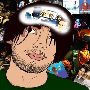
Well...I have chosen my idea, (the illustration/portrait of ME and where my brain would be a cloudy bubble of all the things i love). After I set my mind on this idea i had a look at two pieces of art, Which lend me to to different websites.

First piece, the movie "A Scanner Darkly" the sci-fi film from the novel of PHILIP K DICK, who brought us Blade Runner. I had a look at this film because it has a very good illustrated look.

I had a look at some google searched images and a stumbled (well..more like searched for rather than stumbled) this website http://www.ascannerdarklyartists.com/ it has all the people that worked on the film and a little portfolio of work there work. It is quite interesting.


The Scanner Darkly art is very good, but i think its a bit too detailed for what i'm wanting. So i moved my attention to The Best of Blur album cover.


This is by Julian Opie, i checked out some more of his/hers (not sure) work on his/hers website http://www.julianopie.com/ the site is a bit hard to navigate, but again is quite interesting.

This time the Julian Opie work isn't detailed enough. So i think i'll try to do something in the middle...

This is what i have so far.


I'm pleased with it so far, obviously there is work to be done, but i think the first part is nearly completed.

Friday 5 October 2007

Critical Studies Image Analysis Exercise (part two)

Critical Studies Image Analysis Exercise (part two)

Meadow Hall (website/homepage)


My first impression of the Meadow Hall homepage is “girly,” if you took away the Meadow Hall title I would know this is a website targeting a female audience. I think this for many reasons, the elegant design. All the graphics are easy following. The lady in the middle of the page is drawn in a modern fashion, it is representative to what is known as the “perfect” woman, big eyes, small nose, cute lips, long legs, slim and light hair. All the main design (the lady and the header) is symmetrical, which makes it nice to look at and easy on the eyes. It has a basic easy to use navigation layout with only one menu, which without sounding sexist also tells me it’s a female based site. The designers have been clever with the fonts, they have used a larger fancy font on the headings they want your eyes to be attracted to, however for the information side they have stuck to a much smaller standard “Ariel” font. That tells me they are pulling you in with fun, but they have something serious to say.
The colour scheme is used to the sites advantage. There are very few coloured parts to the site and they are pastel coloured mostly blues and pinks. Although there is one section, which is right in the middle that is yellow. This is under the ladies bags the “what’s on” and “the shops” parts. I guess that these are links, they are basically the only things that Meadow hall want you to click. This is clever designing because your eyes are attracted to the odd colour, it isn’t completely away from the colour scheme, but a big enough change for this to work. There is a lot of white space also know as “negative space,” which I think works in the sites favour. If it had stuff going on in the background it would lose its simplicity.
When we had a group crit somebody mentioned it looks very “sex and the city” (T.V program) and I have to agree, like Meadow Hall are trying to sell you “come on girls have fun and shop.” When looking at it from this view the site looks cheap and tacky. The actual layout isn’t great looks like it could have been made on “word.”
My final thoughts on the Meadow Hall homepage are if I was a male customer not knowing what shops were in Meadow Hall I would be given the wrong impression. It just looks like a clothes shop, where is the technology side…saying that where is the male side.

Absolut (big poster)


When you look at the Aboslut poster you can tell straight away it is for the night life scene, it’s first job is done. The second job is what part of the night life scene is it an advert for? Well, the big bottle definitely tells me its for a drink, second job done. Finally the third job, does it sell Absolut too me? Lets find out.
The design is current with the popular static silhouette imagery, which I have seen a lot of this year. This also confirms it is targeting a young commercial audience. It isn’t singling a target gender more a social culture. The poster isn’t just selling a drink it is selling the versatility of the drink, no matter what lifestyle or where you are Absolut can fit in. The designers do this by splitting the poster into three. Three very different locals, but all look like fun with Absolut. The poster is full of life with no negative spaces, which again says fun to me.
There is very little text on the poster and what is surprising is the word “vodka” is not mentioned. We do have the phrase “find your flavour” I the middle of the page, I would say this is the focal point of the poster. Absolut have been clever with this instead of telling you to buy the product they invite you to find your Absolut. Another reason why I don’t think they mention the word vodka is that Absolut don’t want to be a vodka they want to be Absolut. Somebody said in the crit that when people go into a bar and purchase a vodka drink they will ask for a vodka and coke, Absolut don’t want this they want people to be asking for an Absolut and coke. I agree with this person, Absolut don’t want to advertise vodka because there are many other vodka brands.
Comparing the two together, these are two very different pieces of design, however they do have similar target audiences. The “sex and the city” ladies that shop at Meadow Hall will be the same ladies that Absolut want drinking there drink. The too companies have taken a different approach, Meadow Hall have opted for a gentle touch where as Absolut have gone for the wild side.
From a designers point of view the Absolut poster is a much better piece of art and a better advert. I say this because they have not left anybody out, they have dealt with there target audience well. Meadow Hall has split the gender barrier when they could have quite easily catered for both sex. The Absolut poster had me sold (if I was a vodka drinker), I would like to find my favour, however Meadow Hall makes me think it is going to be filled with lots of annoying high street women.
To sum up my personal analysis would be that Absolut gets ticks in all its boxes where as Meadow Hall have failed to impress me with its sexist tacky style.

Wednesday 3 October 2007

ANOTHER project...haha...your not serious.

This is our third brief and we got two more today in critical studies...

This project we have to create a A4 poster about ourselves, it is only a two week brief so hopefully it'll be nice and fun. We (design class) will also get to see what we are all capable of...design wise that is.

Development ideas.


It all started where everybody else’s started, with…some brainstorming, deep thinking and a thought of “is that all I’m interested in?..”
After going through my five ideas in the crit I am still a bit unsure which one to choose. There is one idea that stands out from the rest, but not for all the best reasons. The main reason being it looks the easiest to do. I know this brief is suppose to challenge you, but with it being a short brief I’d rather stick to something I know I can do and make it look nice, rather than something I’ll struggle with.
The idea is this, an illustrated portrait of myself looking worried at my brain. Where the brain is located there will be a blurred edge window. In side the window will be all the junk (as my mum calls it) that fills my head, also known as interests.
The way in which I will create this, I will start by taking a picture of myself and then all the “junk” I need in my head. In Photoshop I will draw around these object to make them illustrated, cartoon like and slick. They will be coloured in a “cut out” effect, it won’t be shaded as such more blocked colours. As for the background…well that is my secret and you will have to wait and see.


I will stick my sketch book pages up soon...

Tuesday 2 October 2007

The futrue in my eyes

This will be one ramble...be warned, there is no pre-planning this is straight up ranting.

I was just brain storming for the 2020 brief (for those that aren't on my course, in quick terms we have been given an assignment to look into the future "2020" and basically predict a piece of technology), new technology is pretty much easier convenience. We are turning into a lazy world, take the Wii, it has realistic sports games. The Xbox 360 has great online gaming. These are making it so we don't have to leave the house to have fun with friends, whats next "Friday Night" where you get drunk and play a game...or do people already do this. Home cinema! the cinema is a dying breed because people have better technology at home, with their wide screen HD T.V, surround sound and BluRay player. BUT the worst of all is the Internet, don't get me wrong I'm a huge net fan. Online shopping...MSN... even Casino's...the Internet offers pretty much anything and everything so that you don't have to go out of the house. I can't actually think of a reason why i would have to leave the house! There is so much more than what I've mentioned.

This is only today's technology. 2020 is a bit close, but imagine the year 2120! In my previous blog i had the idea of a clean up robot, this isn't something that might happen it is something that will happen. I get awfully scarred when i think of the world we live in. We are losing so much value, I think I will take it in my stride to be a designer to make the world something beautiful, not a bloody Sony Rolly with a vacuum attached to it, but something to capture what we have around us. I don't want to bring up my children in a world where going to the cinema, watching a live band, having some fun in a park is a thing of the past.

More than likely we won't make it to the year 2120 anyway with idiots like Bush running things, will we even make it to 2010...so I don't have anything to worry about.

I think I will continue this in my sketch book, where my brain can run wild on paper rather than this new "blogging" fandangil

p.s. i do think some new technology is good, by using MSN i can talk to my friends in finland for the price of my broadband. Photoshop makes me look like a good artist. Web designing made me some money. Making films is much easy and there is some other stuff.

Monday 1 October 2007

Future project idea, Sony Rolly, Robot Turtles and a whole lot more...


After seeing the Sony Rolly my mind started to wonder, most of the time it wondered to the word "pointless". Why would people buy this? Why would people find this fun to watch? Why...Why...Why. It's not like it cleans up after you...and then **TING!** my idea starts.
This week I have been watching many sci-fi films to help my ideas follow, one film that helped this particular idea was The Fifth Element. There is a scene in this film were Gary Oldman knocks a glass off his desk and many small robots appear to clean up the mess. Unfortunately i can't find a picture on the net.
This made me think about a small robot that could clean up, vacuuming sprung to mind. I don't know how many people will remember the robot turtle from primary school. It was basically a small gray dome, which you inputted the number of paces left, right, back and forth with a digital number pad. Again couldn't find a picture on the net.
Imagine if you took this technology to measure the room size and the technology from the Sony Rolly, stick a vacuum to the front and hey-presto you no longer have to push the vacuum cleaner around!
I'll be adding some more to this blog when the idea unfolds a little more.