Artist Statement
What my final image is about?
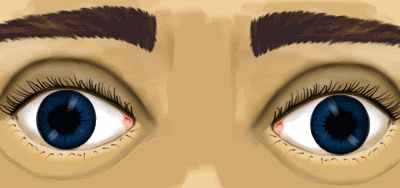
My final image is advertising CLC “contact lens camera.”
A contact lens that can take a picture, like a digital camera in your eye.
This idea came to me in two parts; first of all I had been watching many sci-fi films. In these films there are many different eyepieces, some that zoom others to record footage and some films show you the view through a cyborgs/robots eye. I started to think along these lines an interactive eye. Second part was when I was out and about taking photos. I couldn’t get the photo how I saw it. That’s when it clicked a camera that took a photo of exactly what you saw. The idea is that you get picture perfect images everytime.
Monday, 10 December 2007
Monday, 3 December 2007
2020 brief blink animation
Read title.
If this doesn't work, right hand click and open up in a new wndow.
I really wanted to make a short film advertisement, however i realised that i've not got the skill or resources for what i want to do. So along with a poster i will design i think i am going to do some animation/web based adverts.
If this doesn't work, right hand click and open up in a new wndow.
I really wanted to make a short film advertisement, however i realised that i've not got the skill or resources for what i want to do. So along with a poster i will design i think i am going to do some animation/web based adverts.
Saturday, 1 December 2007
2020 Animation
I was messing around with logo ideas and i quickly did this animation fade. It is rough, could be smoother, but the idea gets across. CLC 2020 this the name of my product.
Monday, 26 November 2007
2020 brief research.
I was up last night thinking of great ways of advertising. The best advert is to get people interested in the product who aren't usually interested in it. This got me thinking about Nintendo, the way they have marketed the DS and the WII is unbelievable. They some how changed a male dominant business into family fun.
Here are some adverts form Nintendo and then some from other leading brands.
As you can see Nintendo advertisements are all about the FUN side, the DS ad even had a well known celebrity, A FEMALE celebrity. This engages everybody and they have opened up the gaming wide to a wider audience with clever marketing.
The Sony and microsoft ads were either about the technology or just a little strange. I can't imagine a grand parent or a mother being interested in these advetisements.
With my CLC being a very technical piece i think i'll concentrate advertising the fun side rather than the technical side.
Monday, 19 November 2007
2020 future brief research.
I haven't blogged in awhile.
This isn't anything too interesting from an outer siders view, but it is a bit of research into Canon Adverts.
For this brief i think i am going to create a short 20/30 second advert on a Contact Lens Camera or CLC as i will call it. Canon are the leaders in photography so i thought it would be a good start to see how they sell there product.
This one doesn't really sell the camera, rather what you can do with the camera. It doesn't mention any features, just gives you a feeling of adventure you can have with the camera.
Again doesn't really tell me any of the features, goes for a extreme stylistic look. Doesn't work on me, but i can imagine gadgit geeks would love it.
THis one is great...doesn't make any sense.
What happened to selling a product on its merits rather than a strange lifestyle????
Although i say this, but i want to create a cheesy ad.
LIKE THIS>>>
ADD THIS >>>
Colgate...they know how to sell!
OH WAIT! i can't forget this all time classic from gilette
On the flip side i will also create some more serious flier and poster designs...
Monday, 29 October 2007
NEW week, NEW day, another NEW brief, FOR F**K SAKE
Got given a new brief today, yipee!
This time I have to create two A4 pages (like a magazine layout) and a mini website, which includes 3 webpages. I am actually looking forward to this.
Here is a bit of research from today:-

This is a typical magazine layout, symetrical, colums the lot.
This next image is called the golden ratio, its mathimatical thing...i'm not too sure, but its pretty important...i should research it a little more.

AND...this last bit is a magazine spread, which i had to mark out the layout.

So...a bit of fun.
Monday, 15 October 2007
About Me FINISHED
This is my final design.
Image size and resolution are both a bit poor due to the internet....
Let me know what you think
Peace out brothers.
Tuesday, 9 October 2007
Monday, 8 October 2007
Development work on the "About Me" brief...some research too!
What have I done?
 I had a look at some google searched images and a stumbled (well..more like searched for rather than stumbled) this website http://www.ascannerdarklyartists.com/ it has all the people that worked on the film and a little portfolio of work there work. It is quite interesting.
 The Scanner Darkly art is very good, but i think its a bit too detailed for what i'm wanting. So i moved my attention to The Best of Blur album cover.

I'm pleased with it so far, obviously there is work to be done, but i think the first part is nearly completed.
What I have been looking at?
Well...I have chosen my idea, (the illustration/portrait of ME and where my brain would be a cloudy bubble of all the things i love). After I set my mind on this idea i had a look at two pieces of art, Which lend me to to different websites.
First piece, the movie "A Scanner Darkly" the sci-fi film from the novel of PHILIP K DICK, who brought us Blade Runner. I had a look at this film because it has a very good illustrated look.
 I had a look at some google searched images and a stumbled (well..more like searched for rather than stumbled) this website http://www.ascannerdarklyartists.com/ it has all the people that worked on the film and a little portfolio of work there work. It is quite interesting.The Scanner Darkly art is very good, but i think its a bit too detailed for what i'm wanting. So i moved my attention to The Best of Blur album cover.
This is by Julian Opie, i checked out some more of his/hers (not sure) work on his/hers website http://www.julianopie.com/ the site is a bit hard to navigate, but again is quite interesting.
This time the Julian Opie work isn't detailed enough. So i think i'll try to do something in the middle...
This is what i have so far.

I'm pleased with it so far, obviously there is work to be done, but i think the first part is nearly completed.
Friday, 5 October 2007
Critical Studies Image Analysis Exercise (part two)
Critical Studies Image Analysis Exercise (part two)
Meadow Hall (website/homepage)

My first impression of the Meadow Hall homepage is “girly,” if you took away the Meadow Hall title I would know this is a website targeting a female audience. I think this for many reasons, the elegant design. All the graphics are easy following. The lady in the middle of the page is drawn in a modern fashion, it is representative to what is known as the “perfect” woman, big eyes, small nose, cute lips, long legs, slim and light hair. All the main design (the lady and the header) is symmetrical, which makes it nice to look at and easy on the eyes. It has a basic easy to use navigation layout with only one menu, which without sounding sexist also tells me it’s a female based site. The designers have been clever with the fonts, they have used a larger fancy font on the headings they want your eyes to be attracted to, however for the information side they have stuck to a much smaller standard “Ariel” font. That tells me they are pulling you in with fun, but they have something serious to say.
The colour scheme is used to the sites advantage. There are very few coloured parts to the site and they are pastel coloured mostly blues and pinks. Although there is one section, which is right in the middle that is yellow. This is under the ladies bags the “what’s on” and “the shops” parts. I guess that these are links, they are basically the only things that Meadow hall want you to click. This is clever designing because your eyes are attracted to the odd colour, it isn’t completely away from the colour scheme, but a big enough change for this to work. There is a lot of white space also know as “negative space,” which I think works in the sites favour. If it had stuff going on in the background it would lose its simplicity.
When we had a group crit somebody mentioned it looks very “sex and the city” (T.V program) and I have to agree, like Meadow Hall are trying to sell you “come on girls have fun and shop.” When looking at it from this view the site looks cheap and tacky. The actual layout isn’t great looks like it could have been made on “word.”
My final thoughts on the Meadow Hall homepage are if I was a male customer not knowing what shops were in Meadow Hall I would be given the wrong impression. It just looks like a clothes shop, where is the technology side…saying that where is the male side.
Absolut (big poster)

When you look at the Aboslut poster you can tell straight away it is for the night life scene, it’s first job is done. The second job is what part of the night life scene is it an advert for? Well, the big bottle definitely tells me its for a drink, second job done. Finally the third job, does it sell Absolut too me? Lets find out.
The design is current with the popular static silhouette imagery, which I have seen a lot of this year. This also confirms it is targeting a young commercial audience. It isn’t singling a target gender more a social culture. The poster isn’t just selling a drink it is selling the versatility of the drink, no matter what lifestyle or where you are Absolut can fit in. The designers do this by splitting the poster into three. Three very different locals, but all look like fun with Absolut. The poster is full of life with no negative spaces, which again says fun to me.
There is very little text on the poster and what is surprising is the word “vodka” is not mentioned. We do have the phrase “find your flavour” I the middle of the page, I would say this is the focal point of the poster. Absolut have been clever with this instead of telling you to buy the product they invite you to find your Absolut. Another reason why I don’t think they mention the word vodka is that Absolut don’t want to be a vodka they want to be Absolut. Somebody said in the crit that when people go into a bar and purchase a vodka drink they will ask for a vodka and coke, Absolut don’t want this they want people to be asking for an Absolut and coke. I agree with this person, Absolut don’t want to advertise vodka because there are many other vodka brands.
Comparing the two together, these are two very different pieces of design, however they do have similar target audiences. The “sex and the city” ladies that shop at Meadow Hall will be the same ladies that Absolut want drinking there drink. The too companies have taken a different approach, Meadow Hall have opted for a gentle touch where as Absolut have gone for the wild side.
From a designers point of view the Absolut poster is a much better piece of art and a better advert. I say this because they have not left anybody out, they have dealt with there target audience well. Meadow Hall has split the gender barrier when they could have quite easily catered for both sex. The Absolut poster had me sold (if I was a vodka drinker), I would like to find my favour, however Meadow Hall makes me think it is going to be filled with lots of annoying high street women.
To sum up my personal analysis would be that Absolut gets ticks in all its boxes where as Meadow Hall have failed to impress me with its sexist tacky style.
Meadow Hall (website/homepage)

My first impression of the Meadow Hall homepage is “girly,” if you took away the Meadow Hall title I would know this is a website targeting a female audience. I think this for many reasons, the elegant design. All the graphics are easy following. The lady in the middle of the page is drawn in a modern fashion, it is representative to what is known as the “perfect” woman, big eyes, small nose, cute lips, long legs, slim and light hair. All the main design (the lady and the header) is symmetrical, which makes it nice to look at and easy on the eyes. It has a basic easy to use navigation layout with only one menu, which without sounding sexist also tells me it’s a female based site. The designers have been clever with the fonts, they have used a larger fancy font on the headings they want your eyes to be attracted to, however for the information side they have stuck to a much smaller standard “Ariel” font. That tells me they are pulling you in with fun, but they have something serious to say.
The colour scheme is used to the sites advantage. There are very few coloured parts to the site and they are pastel coloured mostly blues and pinks. Although there is one section, which is right in the middle that is yellow. This is under the ladies bags the “what’s on” and “the shops” parts. I guess that these are links, they are basically the only things that Meadow hall want you to click. This is clever designing because your eyes are attracted to the odd colour, it isn’t completely away from the colour scheme, but a big enough change for this to work. There is a lot of white space also know as “negative space,” which I think works in the sites favour. If it had stuff going on in the background it would lose its simplicity.
When we had a group crit somebody mentioned it looks very “sex and the city” (T.V program) and I have to agree, like Meadow Hall are trying to sell you “come on girls have fun and shop.” When looking at it from this view the site looks cheap and tacky. The actual layout isn’t great looks like it could have been made on “word.”
My final thoughts on the Meadow Hall homepage are if I was a male customer not knowing what shops were in Meadow Hall I would be given the wrong impression. It just looks like a clothes shop, where is the technology side…saying that where is the male side.
Absolut (big poster)
When you look at the Aboslut poster you can tell straight away it is for the night life scene, it’s first job is done. The second job is what part of the night life scene is it an advert for? Well, the big bottle definitely tells me its for a drink, second job done. Finally the third job, does it sell Absolut too me? Lets find out.
The design is current with the popular static silhouette imagery, which I have seen a lot of this year. This also confirms it is targeting a young commercial audience. It isn’t singling a target gender more a social culture. The poster isn’t just selling a drink it is selling the versatility of the drink, no matter what lifestyle or where you are Absolut can fit in. The designers do this by splitting the poster into three. Three very different locals, but all look like fun with Absolut. The poster is full of life with no negative spaces, which again says fun to me.
There is very little text on the poster and what is surprising is the word “vodka” is not mentioned. We do have the phrase “find your flavour” I the middle of the page, I would say this is the focal point of the poster. Absolut have been clever with this instead of telling you to buy the product they invite you to find your Absolut. Another reason why I don’t think they mention the word vodka is that Absolut don’t want to be a vodka they want to be Absolut. Somebody said in the crit that when people go into a bar and purchase a vodka drink they will ask for a vodka and coke, Absolut don’t want this they want people to be asking for an Absolut and coke. I agree with this person, Absolut don’t want to advertise vodka because there are many other vodka brands.
Comparing the two together, these are two very different pieces of design, however they do have similar target audiences. The “sex and the city” ladies that shop at Meadow Hall will be the same ladies that Absolut want drinking there drink. The too companies have taken a different approach, Meadow Hall have opted for a gentle touch where as Absolut have gone for the wild side.
From a designers point of view the Absolut poster is a much better piece of art and a better advert. I say this because they have not left anybody out, they have dealt with there target audience well. Meadow Hall has split the gender barrier when they could have quite easily catered for both sex. The Absolut poster had me sold (if I was a vodka drinker), I would like to find my favour, however Meadow Hall makes me think it is going to be filled with lots of annoying high street women.
To sum up my personal analysis would be that Absolut gets ticks in all its boxes where as Meadow Hall have failed to impress me with its sexist tacky style.
Wednesday, 3 October 2007
ANOTHER project...haha...your not serious.
This is our third brief and we got two more today in critical studies...
This project we have to create a A4 poster about ourselves, it is only a two week brief so hopefully it'll be nice and fun. We (design class) will also get to see what we are all capable of...design wise that is.
Development ideas.
It all started where everybody else’s started, with…some brainstorming, deep thinking and a thought of “is that all I’m interested in?..”
After going through my five ideas in the crit I am still a bit unsure which one to choose. There is one idea that stands out from the rest, but not for all the best reasons. The main reason being it looks the easiest to do. I know this brief is suppose to challenge you, but with it being a short brief I’d rather stick to something I know I can do and make it look nice, rather than something I’ll struggle with.
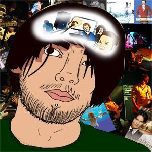
The idea is this, an illustrated portrait of myself looking worried at my brain. Where the brain is located there will be a blurred edge window. In side the window will be all the junk (as my mum calls it) that fills my head, also known as interests.
The way in which I will create this, I will start by taking a picture of myself and then all the “junk” I need in my head. In Photoshop I will draw around these object to make them illustrated, cartoon like and slick. They will be coloured in a “cut out” effect, it won’t be shaded as such more blocked colours. As for the background…well that is my secret and you will have to wait and see.
I will stick my sketch book pages up soon...
This project we have to create a A4 poster about ourselves, it is only a two week brief so hopefully it'll be nice and fun. We (design class) will also get to see what we are all capable of...design wise that is.
Development ideas.
It all started where everybody else’s started, with…some brainstorming, deep thinking and a thought of “is that all I’m interested in?..”
After going through my five ideas in the crit I am still a bit unsure which one to choose. There is one idea that stands out from the rest, but not for all the best reasons. The main reason being it looks the easiest to do. I know this brief is suppose to challenge you, but with it being a short brief I’d rather stick to something I know I can do and make it look nice, rather than something I’ll struggle with.
The idea is this, an illustrated portrait of myself looking worried at my brain. Where the brain is located there will be a blurred edge window. In side the window will be all the junk (as my mum calls it) that fills my head, also known as interests.
The way in which I will create this, I will start by taking a picture of myself and then all the “junk” I need in my head. In Photoshop I will draw around these object to make them illustrated, cartoon like and slick. They will be coloured in a “cut out” effect, it won’t be shaded as such more blocked colours. As for the background…well that is my secret and you will have to wait and see.
I will stick my sketch book pages up soon...
Tuesday, 2 October 2007
The futrue in my eyes
This will be one ramble...be warned, there is no pre-planning this is straight up ranting.
I was just brain storming for the 2020 brief (for those that aren't on my course, in quick terms we have been given an assignment to look into the future "2020" and basically predict a piece of technology), new technology is pretty much easier convenience. We are turning into a lazy world, take the Wii, it has realistic sports games. The Xbox 360 has great online gaming. These are making it so we don't have to leave the house to have fun with friends, whats next "Friday Night" where you get drunk and play a game...or do people already do this. Home cinema! the cinema is a dying breed because people have better technology at home, with their wide screen HD T.V, surround sound and BluRay player. BUT the worst of all is the Internet, don't get me wrong I'm a huge net fan. Online shopping...MSN... even Casino's...the Internet offers pretty much anything and everything so that you don't have to go out of the house. I can't actually think of a reason why i would have to leave the house! There is so much more than what I've mentioned.
I was just brain storming for the 2020 brief (for those that aren't on my course, in quick terms we have been given an assignment to look into the future "2020" and basically predict a piece of technology), new technology is pretty much easier convenience. We are turning into a lazy world, take the Wii, it has realistic sports games. The Xbox 360 has great online gaming. These are making it so we don't have to leave the house to have fun with friends, whats next "Friday Night" where you get drunk and play a game...or do people already do this. Home cinema! the cinema is a dying breed because people have better technology at home, with their wide screen HD T.V, surround sound and BluRay player. BUT the worst of all is the Internet, don't get me wrong I'm a huge net fan. Online shopping...MSN... even Casino's...the Internet offers pretty much anything and everything so that you don't have to go out of the house. I can't actually think of a reason why i would have to leave the house! There is so much more than what I've mentioned.
This is only today's technology. 2020 is a bit close, but imagine the year 2120! In my previous blog i had the idea of a clean up robot, this isn't something that might happen it is something that will happen. I get awfully scarred when i think of the world we live in. We are losing so much value, I think I will take it in my stride to be a designer to make the world something beautiful, not a bloody Sony Rolly with a vacuum attached to it, but something to capture what we have around us. I don't want to bring up my children in a world where going to the cinema, watching a live band, having some fun in a park is a thing of the past.
More than likely we won't make it to the year 2120 anyway with idiots like Bush running things, will we even make it to 2010...so I don't have anything to worry about.
I think I will continue this in my sketch book, where my brain can run wild on paper rather than this new "blogging" fandangil
p.s. i do think some new technology is good, by using MSN i can talk to my friends in finland for the price of my broadband. Photoshop makes me look like a good artist. Web designing made me some money. Making films is much easy and there is some other stuff.
Monday, 1 October 2007
Future project idea, Sony Rolly, Robot Turtles and a whole lot more...

After seeing the Sony Rolly my mind started to wonder, most of the time it wondered to the word "pointless". Why would people buy this? Why would people find this fun to watch? Why...Why...Why. It's not like it cleans up after you...and then **TING!** my idea starts.
This week I have been watching many sci-fi films to help my ideas follow, one film that helped this particular idea was The Fifth Element. There is a scene in this film were Gary Oldman knocks a glass off his desk and many small robots appear to clean up the mess. Unfortunately i can't find a picture on the net.
This made me think about a small robot that could clean up, vacuuming sprung to mind. I don't know how many people will remember the robot turtle from primary school. It was basically a small gray dome, which you inputted the number of paces left, right, back and forth with a digital number pad. Again couldn't find a picture on the net.
Imagine if you took this technology to measure the room size and the technology from the Sony Rolly, stick a vacuum to the front and hey-presto you no longer have to push the vacuum cleaner around!
I'll be adding some more to this blog when the idea unfolds a little more.
Wednesday, 26 September 2007
Scary Life

Scary Life
I have recently been introduce to the virtual world called Second Life. At first this didn’t appeal to me, seemed like a large scale of the Sims.Second Life is a whole lot more you can interact with people from all over the world, create clothes, animation and a lot more. I have also heard that people have made money from this “world”.
After a conversation with a fellow student Mike, I realised how scary this actually is. It is almost something out of an sci-fi movie. We got talking about how this will develop in the future…well in a few years. The whole name scares me “Second Life” why do we need a second life, its almost like we are getting told that our own life isn’t good enough, why live the life your living when you can create the perfect version of yourself, make yourself taller, slimmer, fitter basically anything you want, I got told you can even be a DOLPHIN. The point we made was why sit in front of your computer screen walking and talking when you could do that yourself in “First Life”.
Second Life is a break through piece of technology and does have so many up sides, but people could end up taking it too seriously and it could turn almost into the Matrix, when “Second Life” become our main life. There is nothing stopping technology like this taking over. If you have a better life somewhere else why life the poor one?
It’s a scary thing to think about, it already has a population of over six million and it is ever growing.My final point is we are slowly losing our identities, the internet is providing everybody with the same platform, whether its myspace giving all bands the same opportunity or you tube doing the same to film makers, how do we stand out from the rest. Second Life gives you the opportunity to start fresh, a new manikin to build a better life…
Is this a good thing?
Whatever it is, it scares the crap out of me.
Is this a good thing?
Whatever it is, it scares the crap out of me.
Dholl
Dholl
I found Dholl on http://www.deviantart.com/, an online community of artist varying from fine artist to photographers to web designer to film makers and a whole lot more.
You can see more off his work at dholl.deviantart.com
 I would love to see Dholl do some cell animation in his style. It would take a long time, but the end effort would be worth the wait. Dholl uses a great colour scheme, he really captures the atmosphere and his use of textures make the art come to life.
I found Dholl on http://www.deviantart.com/, an online community of artist varying from fine artist to photographers to web designer to film makers and a whole lot more.
You can see more off his work at dholl.deviantart.com

Dholl combines many different medias to create his art. I believe he starts with a sketch and then fine tunes it in photoshop, he may also use other tools to create different images. I think this is a great way to work, i see too many people restrict them selves to just one media and not explore the same image to other areas. This is something i am trying to do more myself, Dholl has really mastered his style, the backgrounds show signs of realism, however the front characters have there own freaky image. It is similar to comic book artist Roman Dirge (Lenore) and director Tim Burton (Nightmare before Christmas), but Dholl has a much more finished stylized look.
The images still look sketchy and real, they haven't been completely smoothed over in photoshop. I like that for the reason you can see and feel the emotion in the pen strokes. It has that man made quality, which can sometimes get lost in photoshop.
 I would love to see Dholl do some cell animation in his style. It would take a long time, but the end effort would be worth the wait. Dholl uses a great colour scheme, he really captures the atmosphere and his use of textures make the art come to life.
I urge you to take a look at the rest of his work, he deserves some attention.
Facebook Vs Myspace...
 The online community battle goes on...
This week for my college course i signed up to a few online communities, i was already a member of Myspace and personally thats where i draw the line. I'm not the sort of person who buys into fashion sites, however i wanted to look at the navigation layouts. It quickly came to my attention that Facebook and Myspace were the two big guns in the online community set up.
Myspace
I have been a member and a fan of Myspace for the last three-ish years now, its quick, fun and easy to use. The navigation system is that simple to use a monkey could get the hang of it.
Those that know a bit more about html can customize there account, add pictures, music, videos, pretty much anything they can find on the net.
The database search engine works well and friends are easy to find. Anyone can view your account and look through your friends list, however you can set your profile to private, which means only your friends can view your profile and people that wish to need to add you as a friend first.
The possibilities for Myspace are endless, it has already revolutionized the music industry and it is doing the same to film and television. Myspace has given everyone a voice to express there thoughts and feelings, whether it is blogging on there page, sending out a bulletin or even going on a forum.
I am a new member of Facebook and my first impression is that the site is awful, it seems hard to work and i'm forever lost. The navigation is terrible, there are links everywhere and there are far too many. When you go on a site like this you want something simple and easy to use, not something that gives you an headache. These sites are built for fun, but Facebook seems a little confusing.
Looking at the website from a designers view, it looks ugly, there are bits and pieces all over your profile. It becomes a strain to look at.
This website doesn't compare to Myspace, it is a poor imitation of it...
Is it just me or is all the hobo/zombie wars seem silly and confusing. What i have found quite interesting about Facebook is that some of my old school friends have uploaded old pictures and this is a popular thing throughout the website. In my eyes Facebook is only good for nostalgic reasons.
I'd like to know other peoples views on these online community sites, am i the only one that is sick of filling out about me, film, music sections...
I haven't finished with this blog, i may add some more to it in the near future.
Monday, 24 September 2007
It Begins
The journey of blogging begins here.
This starts my critical studies into the world of blogging...
For my college course, Design for Digital Media
This starts my critical studies into the world of blogging...
For my college course, Design for Digital Media
Hopefully over the next few weeks turning into months i will gather research of other peoples art work, and i will be posting some of my own or all to view and comment.
You can learn about me by looking in the ... wait for it ..."about me" section, if you would like to know anything else please contact me.
I am a resident of the myspace community my myspace LINK and also check out my band my bands myspace LINK
Thats it for now, keep tuned in...
Subscribe to:
Posts (Atom)