Evaluation.
James Wall
FEAR Ident.
I thought this was a good project to start the new year off with, a short interesting piece. When given the brief I was immediately drawn to the “Fear” option, although I did consider and have a good think about the other three. I wouldn’t say that horror/thriller is my comfort zone, but I do think at this stage horror is easier to create and make look good.
I dived straight into this brief and started planning and creating off the mark. After the short horror film we did at the end of last year I had a much better idea of time keeping. This year I have bought myself a pocket diary and so far I am keeping to it well. I think there is still room for improving in time keeping, by the middle of the project I started to stray, but pulled it together by the end.
Learning After Effects as been a massive plus. Never used it before the brief and I feel it came natural and I can open the software positively and know my way round it. I believe the most impressive after effecting section of my ident is the person appearing around the strange steps. I think this because I had to mask the person onto the steps and then I masked a static TV signal in the same shape to make it look like the person were tuning in and out, much like on the Ring.
I also think my Final Cut editing skills are getting loads better. I seemed to be-able to edit quickly and have learnt the key board short cuts. However, I am still have great difficulty getting my exporting right. At the moment I like to export a quick time reference movie out of Final Cut then export it again through After Effects.
Looking back over my work I would have liked my presentation to be more professional. I do think my presentations are becoming more confident and I’m starting believe in myself, that I do have something to provide and be proud of. And, I think that is the key to a good professional presentation, if you believe in yourself than others will too. I know I have the ambition to want to do well, but now I have to convert that ambition into confidence.
Overall I am pleased with the outcome of this brief. In the way I have worked as an individual and known when to ask others for help. For example when filming I knew I couldn’t do it by myself, so I made sure I planned time with another student to get it done. This was probably the first brief I felt completely comfortable that I was going to get all the work done on time, (besides this evaluation).
Now I am looking forward to tackling the next brief, knowing that I am not worrying and I am pleased with this ident brief.
Saturday, 25 October 2008
Tuesday, 21 October 2008
DONE! FINISHED! POW!
YEY! I've finished the editing on my ident. I have to say i am very pleased with the out come.
Please follow the link, and watch it in full high quality youtube fun. http://uk.youtube.com/watch?v=FSTbV3RkdTg .
Cheers
Labels:
after,
animation,
cgi,
development,
effects,
film,
HD,
ident,
james wall,
new memeber,
personal,
personal development,
Personal work,
sound,
special,
TV,
work
Monday, 20 October 2008
MOOD BOARD
This is my mood board, i have been adding to it over the past few weeks as and when new pieces have inspired me.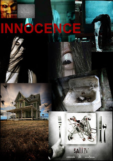
When you click the image you can see a larger scaled one.

When you click the image you can see a larger scaled one.
Labels:
ident,
james wall,
personal development,
Personal work
Tuesday, 14 October 2008
Films i've watched recently...
For the people that don't know me that well yet...i love films, i spend most of my time watching them and believe i have a good judgement on what makes a good flick. I watch all sorts of films from comedy to world cinema and action to drama, anything.
Here is a couple of films that i have watched over the past week or two that have stuck out.
I've watched or re watched a lot of horror films, for research for my college brief.
MONGOL. The story of Genghis Khan.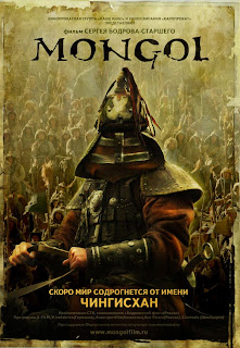 Mongol was visually great. The long shots of landscapes in all types of whether looked awesome. The film was so detailed. The battle scenes were very well created and the CGI is subtle, It wasn't like your Hollywood epic battle film. You don't realise that the blood has been CGI'd until you take a closer loook. I would recommend this to anyone, and the rumour on the net is that this is the first of three films.
My only problem with the film was the subtitles, they were difficult to read in parts the lighter parts of the film.
THE HOST.
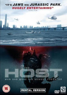 This was a good, a Korean film. Reminded me of the old B-movie films, i didn't know whether to laugh in parts or be scared. Again the visuals were excellant, i've always said that the orients have better use of cinematography and colour balance.
The only thing i could pick at is the sea monster, the interactivity with the monster is very good, but close ups of the monster didn't look as good. I think this is down to the textures, it was very smooth looking. I reckon a bit of texture would have made it a whole lot more believable.
You can see this was inspiration for the recent Cloverfield.
BRAINDEAD.
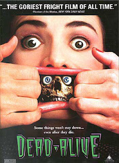 Pete Jackson's finest two hours...only kidding. I re-watched BrainDead having not seen it in a few years. It is quite ridiculous, but thats what makes it good. I don't know where in Peter Jackson's head he thought of a RAT MONKEY! Not only a rat monkey, but one that bites people and turns them into zombies would work... The stupidest ideas truely are the best.
I don't think i've seen a film with this much blood!
I think it was made on a small budget (around 1.5million) and to say that...the SFX are good, their not remarkable or groundbreaking, but for the style of film it works.
OTHER FILMS I'VE WATCHED
The SHINING
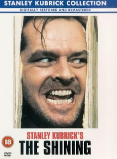 What i love about the Shining is the sound, it's not like most horror. It's nice classical music, but every now and then it hits a de-tuned note. It's like John Williams doing horror.
Here is a couple of films that i have watched over the past week or two that have stuck out.
I've watched or re watched a lot of horror films, for research for my college brief.
MONGOL. The story of Genghis Khan.
 Mongol was visually great. The long shots of landscapes in all types of whether looked awesome. The film was so detailed. The battle scenes were very well created and the CGI is subtle, It wasn't like your Hollywood epic battle film. You don't realise that the blood has been CGI'd until you take a closer loook. I would recommend this to anyone, and the rumour on the net is that this is the first of three films.
My only problem with the film was the subtitles, they were difficult to read in parts the lighter parts of the film.
THE HOST.
 This was a good, a Korean film. Reminded me of the old B-movie films, i didn't know whether to laugh in parts or be scared. Again the visuals were excellant, i've always said that the orients have better use of cinematography and colour balance.
The only thing i could pick at is the sea monster, the interactivity with the monster is very good, but close ups of the monster didn't look as good. I think this is down to the textures, it was very smooth looking. I reckon a bit of texture would have made it a whole lot more believable.
You can see this was inspiration for the recent Cloverfield.
BRAINDEAD.
 Pete Jackson's finest two hours...only kidding. I re-watched BrainDead having not seen it in a few years. It is quite ridiculous, but thats what makes it good. I don't know where in Peter Jackson's head he thought of a RAT MONKEY! Not only a rat monkey, but one that bites people and turns them into zombies would work... The stupidest ideas truely are the best.
I don't think i've seen a film with this much blood!
I think it was made on a small budget (around 1.5million) and to say that...the SFX are good, their not remarkable or groundbreaking, but for the style of film it works.
OTHER FILMS I'VE WATCHED
The SHINING
 What i love about the Shining is the sound, it's not like most horror. It's nice classical music, but every now and then it hits a de-tuned note. It's like John Williams doing horror.
THE INCREDIBLE SHRINKING MAN
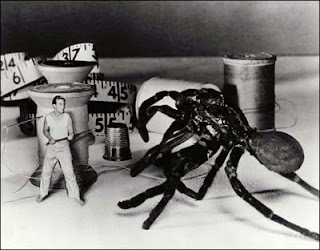 The Incredible shrinking man is remarkable for its time, its a most see film for people interested in visual effects. They were doing things well ahead of there time.
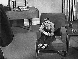 You won't see a film like this now-a-days, because studios will always opt for CGI. The massive sets are really impressive.
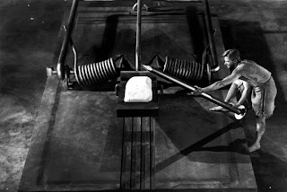
 The Incredible shrinking man is remarkable for its time, its a most see film for people interested in visual effects. They were doing things well ahead of there time.
 You won't see a film like this now-a-days, because studios will always opt for CGI. The massive sets are really impressive.
I loved every second of this film.
Labels:
cgi,
development,
effects,
film,
ident,
james wall,
personal development,
Personal work
Saturday, 11 October 2008
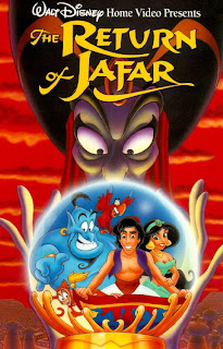
Return of Jafar!
Aladdin was a great film, a landmark in animation.
I've recently bought the box set trilogy, and at the time of purchase i'd never seen the two follow up movies. I knew they weren't going to be as good as the first one, but i thought they must be decent films.
I watched Return of Jafar last night and what a piece of shit. The animation wasn't bad, but for disney standards...for Aladdin standards it was very poor. The songs were just hash pieces, re-worked songs from the first film, but with the awful parrot singing them!
I thought the film was going to pick up when the genie enters, and to my surprise HOMER SIMPSONS voice comes out. I knew Robin Williams didn't do it, but i didn't know Dan Cast-la-dilli (how ever you say it) re-placed him. When i was watching it i was thinking i'm sure thats Homer...
Anyway, i've checked the third one out on IMDB and Mr Williams is back so it might be alright, but if this is something to go by i wish i'd have just bought Aladdin.

Labels:
aladdin,
animation,
development,
disney,
film,
james wall,
personal,
work
Thursday, 9 October 2008
Title sequences break down.
Hello,
I thought i'd take out the time to do a break down of my after effects channel four horror season title sequences. This is not the one i am going to use in my final ident, but it is close to it.
I am not that great at after effects, only been using it a week, but i hope this helps anybody having trouble. It's not a tutorial, but more of an order.
First off here is the sequences.
Right, the first thing i did was make a composition and then imported a channel 4 logo from the net and colour corrected to black and white. Then i animated it. The scale first, key framing it from large to small. The 3D and light/colour effect i didn't add till the very end. After that i added the FEAR text, which goes from right to left, getting bigger. The idea was to have it coming from behind the 4. I used an effect called "glow" to...yes that's right, make it glow. I key framed the brightness to dim in and out, i did this to make it more eye catching.
OK, then i key framed each individual letter of the "horror season" to fall down at different speeds to get the fallen, drip feel. The last bit for this first part was a simple opacity fade of the coming soon...
Once i was happy with the time scale of this i opened a new composition and dragged my previous one in. I did this so i could work with all the elements as a whole. I can later go back to that first composition edited it and it will change in this new second composition.
Ok, I made the whole sequence a 3D layer and added a spot light and 25mm camera. I key framed the light to change from a light yellow to a dark red, which helps translate the theme. I edit the features within the spot light, for example the intensity and feathering. Then i key framed the camera to zoom out on a tilt, then square up with the red light and lastly zoom in right towards the 4. This gives you the feel that the 4 is moving around much more than it actually is.
Labels:
after,
animation,
development,
effects,
ident,
james wall,
personal,
special,
TV,
work
SOUND and VISUALS, Fear ident.
On my previous blog you can view my animatic with the near to finish sound and and idea behind my footage.
What inspired the sound was the word "innocence". There is something very displeasing about innocence sounds, a young girl singing, a whined up ballerina toy, the sound of a baby laughing or crying.
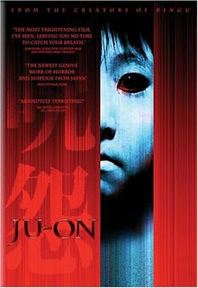
Also Japanese horror, films like the Ring and the Grudge have these very beautifully crafted sound tracks. Here is the trailer for the Grudge,
the trailer portrays exactly what i am talking about. It starts out quite dark, ambient and then this nice piano takes over, but it still feel wrong.
This is the Trailer for the ring
This shows the kind of idea behind my background score. I used reversed and slowed down music, then picked out bits of song (which are song recordings of my old band) which sounded right.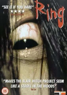
For the visuals i am going to create footage which in corporates both cult and contemporary horror/thrillers. I think this will appeal to to all horror fan audiences.
What inspired the sound was the word "innocence". There is something very displeasing about innocence sounds, a young girl singing, a whined up ballerina toy, the sound of a baby laughing or crying.

Also Japanese horror, films like the Ring and the Grudge have these very beautifully crafted sound tracks. Here is the trailer for the Grudge,
the trailer portrays exactly what i am talking about. It starts out quite dark, ambient and then this nice piano takes over, but it still feel wrong.
This is the Trailer for the ring
This shows the kind of idea behind my background score. I used reversed and slowed down music, then picked out bits of song (which are song recordings of my old band) which sounded right.

For the visuals i am going to create footage which in corporates both cult and contemporary horror/thrillers. I think this will appeal to to all horror fan audiences.
Monday, 6 October 2008
Ident Animatic
Hey hey,
I've done a mock up of my Channel four "FEAR" ident as a animatic.
Traditionally animatics are still images, but with this idea it was very hard to plan out on paper how i wanted it to look. So, i thought i'll just do it! I've filmed sort of what i will do.
My idea is to make you feel like your TV has gone dodgy and then these unsettling images appear. You can also hear my soundtrack, but that also needs tweaking.
Here we go
I know that youtube isn't the best quality, but i think it gets my idea across. Also the cut footage is just a knife and a sink, i do have other footage in mind to film.
The sound i am really pleased with but i'll explain that in a new blog.
Multipul Me's!
I've been testing my skills out on after effects, i really like doing special effects. I've never been a massive fan of too much CGI/post production work, but i can see why production companies opt for this. I think post production or SFX is an area i'd like to start in...possibily...
Anyway this is me five times in the same room.
"How did i do this?" i hear you say...
Well, I filmed myself five times, then layed them up in after effects and masked round four of them. I thought this would be a lot harder than it actually was.
My next task is to make my head blow up! using a combination of post production and on set SFX.
Labels:
after,
cgi,
development,
effects,
film,
james wall,
personal,
special,
work
MAX PAYNE
The new action film Max Payne as we all know is an adaptation of a video game. I don't think there as ever been a good video game film! FACT!
Here is the trailer.
The one Thing i have read, which is pretty cool is that the makers have used a new type of camera the records at 1000 frames per second. This means they can get that super slow motion effect like in the video game. You can see this effect in the trailer.
From the one and half minutes i've seen it looks rather like a story from Sin City, the sound, visuals and style.
I suppose we'll have to wait and see...
Labels:
effects,
film,
james wall,
max,
payne,
personal development,
Personal work,
special
Thursday, 2 October 2008
after effects
Never used after effects before this week, i've had a understanding about it, how it works and what it does. And, a couple of times i've even opened it clicked a few buttons and closed it down. After effect is a program i have been wanting to learn and i have relished this oppurtunity to learn.
With the few skills i learn't i my first class i made these channel four "fear" title screens.
This is my first attempt
Basically it is a photoshop file and i have layered the layers on top of each other in the correct order and animated them. This technique can work to good effect, used in the right way. I have also used a spot light, to give it a feathered edge.
SECOND ATTEMPT
This attempt is better. I've used the spot light more effectively, animating it, using it to help create an atmosphere. I have also animated a blur on the text.
THIRD ATTEMPT
On this one i have used a mask on the text so that when the spot light intensity gets higher the mask fades in. I believe this works well.
FOURTH ATTEMPT
This is similar to the third one, but this time i've used a camera. The cameras in after effect are a great tool, thay enable you to create a 3D style look.
After combining all my skills i have created this ident.
I think that this is pretty close to professional. I've used many skills, Cameras, lights, key frame animation, compositions inside compositions, the lot. I'm really pleased with this effort.
Labels:
after,
animation,
cgi,
effects,
film,
ident,
james wall,
personal development,
Personal work,
special,
The,
TV
Subscribe to:
Comments (Atom)